A release nearly two years in the making. When MartianCraft took over development of Briefs last year, we had grand plans. We’ve always had more up our sleeve.
From the earliest alpha we maintained a version of Briefscase for Android. In fact, we pulled the Android version out of 1.0 just a month before shipping1.
The 1.2 release became known as the Android release in our plans, but is so much more. A lot happened over the summer. Apple shipped iOS 7, with it’s completely reimagined user interface. You, our loyal customers, demanded printing. And while we were throwing in new platforms we thought “what the hell” let’s add desktop support, too. And that’s how we arrived here today.
Briefs 1.2 brings our fledgling format to more platforms than ever before. You can play them back on iOS, Android and the Mac. And now you can print them as gorgeous app blueprints to share with anyone on paper.
Adaptive Layouts.
Support for Android was never as simple (!!) as porting Briefscase to Android2. Android’s layout system is much more sophisticated than iOS’ and our coordinate system for Briefs was modeled after the original iPhone’s coordinate system. Fixed size timelines wouldn’t fly on the thousands of wildly different Android devices. We needed images and backgrounds to stretch so they could accommodate variable size devices with different aspect ratios. Likewise, views in Android are not placed absolutely at a particular coordinate. Instead they are positioned relative to the screen boundaries and each other.
Our first solution was to build special templates for Android that would contain variable coordinate systems and function different from their iOS counterparts. It was a shitty design that lead to a shitty experience for our customers who needed to design for both Android and iOS. We had to do better. The result is what we call Adaptive Layouts.
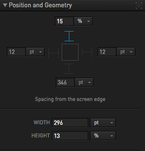
Starting in 1.2, all briefs use our new adaptive layout coordinate system. Briefs built before 1.2 will automatically recognize the new coordinate system, since the old coordinate system is a mathematical subset of the new one. You position elements by pinning them to a screen boundary (by default, the top and left edge). Actors that aren’t pinned to either edge are centered along the axis or if they are pinned to both edges on an axis they’ll stretch to fill that axis. You can define margins from those edges in either points or percentages of screen width and height. Similarly, actor size can be percentages as well as points. For curious Android designers, our points correspond directly to the density independent pixels—or dips—that Google prefers you use. The position and size of the scene and every actor are determined at playback, based upon the size, aspect ratio and density of the screen.
It sounds complex, but we’ve done the hard work for you. To most of our customers, this will feel like a friendlier, more capable way of determining actor geometries. And this new layout system is awesome, not just for Android, but also for iOS. Simulating a keyboard sliding into view is now a breeze, since you can anchor it to the bottom of the screen with a simple checkbox in the transform action. Adaptive layouts also provided a path for properly supporting desktop briefs since a brief can now predictably adapt as you resize the simulator window.
Printing.
From our very first release, customers have written to us requesting (oftentimes demanding) support for printing briefs. I was baffled for months, since the entire purpose of a brief is to be seen on the device. It never occurred to me that someone would want to print out a brief. Once we started working on the feature, however, our print design became obvious.
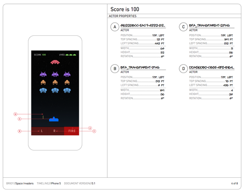
We took the experience from our app and translated it onto the page as a printed blueprint. Now your brief can serve the same purpose around the table that technical drawings have served for centuries. As a PDF or a physical printout that can be marked up, a brief has never been more accessible. We’re incredibly proud with how this feature turned out. I wish I could witness the first time a developer gets a brief printout as spec for an upcoming app project.
You can print directly to paper or export the printout as a PDF. Each scene gets a detailed page (or three, depending on complexity), along with a series of app flow diagrams up front that explain how one screen flows to the next. The entire page is rendered beautifully using our corporate version of DIN and our custom-built architectural typeface, Gayle.
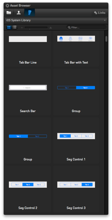
All New Briefs Library.
For 1.2 we completely overhauled our built-in libraries, starting over from scratch. We include production libraries for iOS 7, Android and the Desktop. We’ve also consolidated our blueprint library for all platforms into a single, easy-to-use wireframing library. Our iOS 7 library replaces the previous iOS 6 production library because you shouldn’t be designing new apps for iOS 6.
All Android library items are stretchable assets that include all four Android densities by default, so they’ll holdup to different device layouts and aspect ratios. To rebuild the libraries we built a custom target of Briefs that allows the library files to be created and later edited inside of the app. Exposing this feature so you can build your own custom libraries is something we’re considering for the future.
1,924 Devices.
After publishing the Android version of Briefscase to Google Play earlier today, I tweeted that Briefscase now supports 1,924 different devices. Briefscase for Android can be downloaded on Google Play directly from your phone or sent to your phone from the Google Play website.
In practice, the Android version works exactly like the iOS version of Briefscase. Publishing from Briefs to Briefscase works. BriefsLive works like a charm. But there are a few bonus features we snuck into the Android version that will make its way back into the iOS version down the road. Once you’ve downloaded the app, go to Settings and toggle Blueprint mode. With that mode enabled, actor images and scene backgrounds are replaced by a schematic view that tells you exactly the size of your actors and their names. Its a fun view that we used to debug Briefscase for Android during development and it was so helpful our Android developers demanded3 we keep it as a feature.
When building an Android brief, select either handset or tablet for your timeline templates. This will enable our canvas resizing drop down that allows you to preview different device sizes directly in the canvas. Additionally there are options in the Briefs simulator for different device sizes.
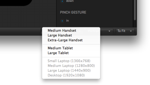
After playing around with the new templates, you’ll notice that both of these have four different resolution settings (1x, 1.5x, 2x and 3x), instead of two. These densities correspond directly with mdpi, hdpi, xhdpi and the new xxhdpi screen densities in Android’s parlance. The Asset Browser now automatically recognizes images with a @1.5x, and @3x suffix, just as it already did for @2x retina assets. When preparing assets, we recommend adopting these suffixes for your files and things will just work when bringing them into your brief. We will automatically generate lower density versions of your assets if you place a 2x or 3x asset onto the screen.
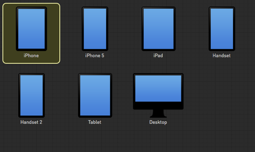
The iPhone and iPad templates will remain as legacy support for targeted iOS designs, but these newer more generic templates are built for the future.
Getting Help.
Until version 1.2, help documentation was missing-in-action. It was an embarrassment that we shipped 1.0 without comprehensive documentation and with 1.2 we’re finally turning back that mistake. First and foremost, the help menu item no longer redirects to our Tender forum, it takes you here where you can find a host of new information. How to submit feedback from within the app, how to reach us for direct support and also a link to our user forum where our developers and staff answer your questions in front of the class.
We’ve also added two new sections: documentation and a getting started guide. We’re not quite finished getting the documentation online, but it will be there before the end of the month. What is up there is a 20 page quick-start ebook. You can download it as a PDF or download it to your iPad as an ePub.
The getting started guide walks you through step-by-step instructions on building your first brief—we even provide pre-built assets so your screens can match exactly ours. It was a lot of fun to build and we have a more advanced ebook in the works to show how to do some more advanced things with Briefs. If you were confused by the complexity of Briefs when you tried it before, I highly recommend downloading the Quick-start guide and giving it a try. It’s a lot of fun.
A Robust Platform.
Briefs is now three distinct apps, distributed in three different app stores. As a prototyping platform it can articulate your vision from mobile to desktop, from iOS to Android. If you design software for a living then building a brief can you give you an understanding unmatched by other design software around today.
1.2 represents what we intended to build for version 1.0 nearly two years ago and it is lightyears beyond what I imagined in 2009 when I first presented the concept. And we’ve just gotten started.
Try out Briefs today by downloading our free trial or purchase on the Mac App store for $199.
-
One of our earliest rejections for 1.0 from Apple was due to our use of the word Android in Briefs. Talk about having to keep our mouth shut. ↩
-
Our beta testers might remember that we completely redesigned Briefscase three months before shipping 1.0. Not only did we throw out our entirely custom iOS UI, we silently threw out our custom Android UI as well. ↩
-
And by demand, I mean that they shipped it as a toggle in Settings, without asking me first if it should stay in. This is the kind of anarchy I endure around here. ↩