Delusions of Grandeur August 2016
A Non-Retina Mac in 2016.
I just bought a new computer, with a non-retina screen. What was I thinking?
For starters, I thought a lot about how I would use the computer. Mundane stuff like playing music, reading email, browsing the web, and sending messages is done in iOS, either on my phone or an iPad. Both devices have retina screens and these tasks benefit from a higher resolution screen.
Does a computer for writing text—code, prose, terminal commands, etc—really need a retina screen? I use a fixed-width typeface for writing, which can look sharp on a non-retina display if you configure things right. My trick? I turn-off text anti-aliasing, and use my trusted friend: Monaco 101.
Below I describe how I configure commonly used apps on the 11” MacBook Air.
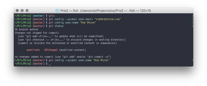
Terminal:
There’s a handy checkbox in preferences, entitled “Antialias Text”. Ensure it isn’t checked and crisp text awaits you.
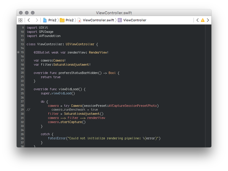
Xcode:
Colin Donnell figured out the incantation for sharp text in Xcode.
defaults write com.apple.dt.Xcode NSFontDefaultScreenFontSubstitutionEnabled -bool YES
defaults write com.apple.dt.Xcode AppleAntiAliasingThreshold 24
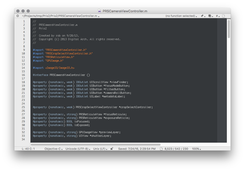
BBEdit:
A quick search of the Expert Preferences page, yields a specific default for disabling Monaco anti-aliasing.
defaults write com.barebones.bbedit DisableFontSmoothing_Monaco -bool YES
Perfect.
Ulysses:
I couldn’t find a way to disable anti-aliasing. Fortunately Ulysses has an uncluttered UI, so I have room for a larger text size.
Instead of Monaco, I write prose using the beautiful Courier Prime Code typeface with an 80 column line width2. Appropriately zoomed, the typeface renders smooth and clear on a non-retina display.
Then again, if it starts to bother me, I can always use Ulysses on my iPad Pro.
-
Not just any monospace font will work, you need one with embedded bitmaps for your desired size. Monaco has embedded bitmaps for 6pt, 8pt, 9pt, and 10pt. Other typefaces to consider: Anonymous Pro, or Proggy if you’re an old Windows convert. ↩
-
Courier Prime was created for writers, by writers. No surprise that it is excellent. Since it tracks wider than other monospace fonts, the anti-aliasing has more room to breathe at larger sizes. ↩